SEO (Search Engine Optimization) is about all the ways you can improve your website to…
7 Examples of Pet Sitter Websites That Perfectly Connect With Visitors
 Is your pet sitting website your biggest and best marketing tool?
Is it paying off or is it sucking the life out of your business?
Just like with any other marketing tool, you need to see a good return on your investment in order for it to be working.
Put a price tag on the time alone you’ve devoted to your site and decide if it’s working with you or against you.
A pet sitting website that works is one that ranks well in the search engines and, perhaps more importantly, converts your visitors into happy clients.
In order to gain that new client, you must first connect with your visitor through your site.
Here’s a list of 7 pet sitting websites that do just that in different ways. I bet if you adjusted your current site to reflect these elements, you’ll see improvement.
7 Pet Sitting Websites You Can Learn From
Our website clients get results. I say this because I feel like a proud father. Maybe it’s that I’m a LEO, but I take pride in everything I do, and when I see something a professional pet sitting colleague of ours is doing well, it makes me feel great inside.
It should also excite you since the quickest way to success is to model yourself after what is already working.
As Tony Robbins puts it: “Success leaves clues. Go figure out what someone who was successful did, and model it. Improve it, but learn their steps. They have knowledge.”

We continue to analyze hundreds of our pet sitting client websites to see what they are doing well and today you will find details on 7 successful websites.
While reading through each, click over to their website to see it in action. And begin to think how you can apply the same concept or technique to your own website.
Remember, this is not about copying what someone has done (that’s bad) but rather looking at what they did and modeling a similar approach to fit your website, goals, and business plan.
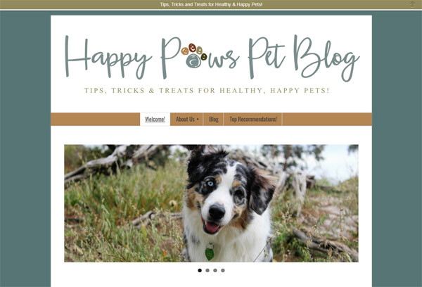
1: Alex Dundon, Happy Paws Pet Blog
Alex is a magnificent case study on how to properly use blogging as a means to educate your audience and add value to your business. She has since decided to give up her pet sitting business (she refers out to a professional colleague) and now blogs exclusively through her website on all things pet related.
What I Love Most: Alex has a clear and succinct structure of different categories that you can browse through. Nicely organized into sections like Pet Safety, pet health, and Gift Ideas and Reviews.
Bonus: Want a crash course on how to find the best blog topics for your own pet blog? Start Blogging Now: 5 Places To Look For Dozens of Topics for Pet Sitters
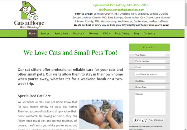
2: Jay Pattiz, Cats at Home Mokan
Jay had such great success with his initial pet sitting website with us (https://warrensburgpetsitting.com/) that when he decided to expand and focus exclusively on cats only, he again trusted us with developing his second website, Cats at Home Mokan.
What I Love Most: Jay knows how to deliver value to his ideal (cat) client by offering a step-by-step DIY instruction for ‘Creating Your Own Scratching Post.’ Look down the right side of every page for the colorful banner and when you click on it, you enter in your email address and receive the instructions he promised.
This is a fantastic way to entice visitors to share their email address with you so you can keep in touch with them through the year.
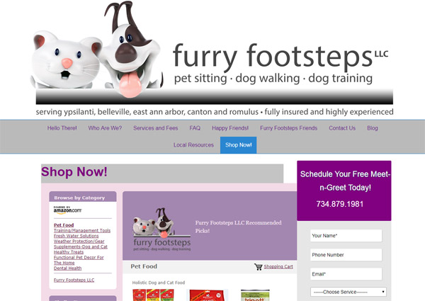
3: Millicent Little, Furry Footsteps
It never hurts to think of ways to earn some extra cash and generate positive cashflow in your business. One way Millicent Little achieves that goal is by offering valuable pet product suggestions through a Shop Now tab on her website.
She has become an Amazon Affiliate and places the exact products (or category of products) on her page. Not only is she offering value to her website visitors and clients but she will also earn a percentage of every sale from Amazon that she sends.
Bonus: We asked Millicent to provide some additional insight to what inspired her to create the shop. This is what she said:
The decision to add a store to my website came about for couple of reasons. Before creating the store, I had recently written a blog post featuring pet friendly communities in my area and as a result, I began receiving many client web submissions from people new to the area that needed pet sitting.
When we would have the meet and greet, most of these clients needed information about the best pet supplies and vets in the area. This led to the creation of my Local Resources tab, which features a lot of local small businesses and brick and mortar pet related businesses.
While this was a valuable addition to my website, many of my clients are super busy and prefer to shop online. I conducted an informal survey where I learned that 90% of my clients regularly shopped on Amazon, mainly because they were Prime members.
I learned about the Amazon Affiliate program from networking with a few other entrepreneurs that were in non-related pet fields and had a lot of success using their stores to sell products that they recommended to clients.
This was great for me because my clients regularly come to me for advice about various animal related products. When I created my store, the products that I feature have all been used personally by me or my clients.
It has been really successful because when I recommend a product to a client and they ask me where they can purchase it, I direct them to my website’s store. I regularly go through and make sure that the products pricing and vendor ratings enable my clients to have a trustworthy, cost effective experience when shopping on my website.
Recently I have been able to assure my clients that when they shop on my website, it’s secure and all of their purchases and private information is guaranteed to be safe, thanks to PetSittingOlogy’s addition of securing my website with an SSL Certificate!
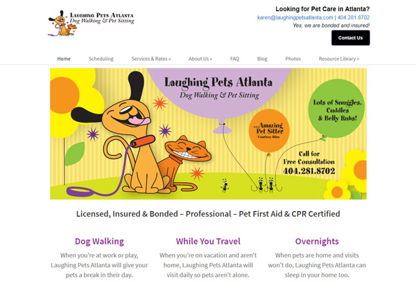
4: Karen Levy, Laughing Pets Atlanta
I’m sure you know that as a pet care professional you are in the business of “trust”. No matter how you look at it, everything you do is designed to build trust between you and your potential clients.
What I Love Most: One way Karen achieves that trust is by creating a “Why Hire Us” page. It details six core strengths that Karen uses to differentiate herself from all others. The subheading for that page is “Loving Animals is not Enough!”
Since you live and breath your business 24/7 you may take for granted all the reasons someone should hire you instead of asking a friend or neighbor. Don’t make that mistake. Go ahead and list out your best traits and add the page to your website.
You’ll be surprised how quickly you instill a greater sense of trust in those looking to work with you.
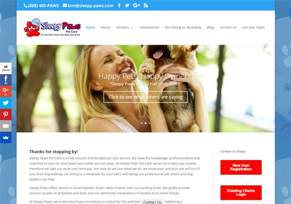
5: Dave Westwood, Sleepy Paws
Do you know the one main goal of your website? You should always be asking yourself “What is the absolute one thing I want each of my visitors to DO before leaving my site?”
It will most likely be to contact you in some form (call, email, message, fill out form, register…) Dave Westwood has implemented a variety of ways to motivate the visitors of Sleepy Paws to make contact.
What I Love Most: My favorite way that you can make contact with Dave on his website is through a little fixed ‘Contact Us’ tab found resting near the bottom of all his pages.
You can’t miss it. This means that at the exact moment a potential client is ready to get in touch, she does not have far to look.
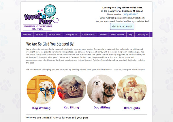
6: Jennifer Hamilton, Woof’n Purr
Chances are you serve more than one area, neighborhood, or town. How do you best display these multiple service areas in a way that Google and your ideal client will value.
First, I’ll tell you what not to do. You do not want to create a bunch of pages with the exact same content and only change the name of that service location.
What I Love Most: Jennifer has mastered the art of showcasing multiple service locations for her pet sitting business. She wanted to attract people travelling and relocating to these new areas.
PS: How perfect is it that she actively looks to target and win new clients who have just moved to her service area! Wouldn’t those pet parents quickly be in search of a professional pet care provider like you?
When creating a new service area page, you should become extremely familiar with all things in that area (use Google if you have to in order to find landmarks, popular events and little known facts).
Create this new service area page that is unique and relevant to the new area you serve. Also, include reviews from clients in those areas. Highlight pet friendly restaurants, stores, and hotels specific to those areas.
Bonus: Once you highlight a pet friendly store or restaurant, get in touch with the owner and let them know. They may just give you a shout out on their social media page.
Want another bonus tip? See if an owner of a pet friendly establishment would be happy to answer a few questions you may have for a blog post you are writing.
Come up with a few questions that you can email over to a pet friendly establishment owner and ask if they would be willing to answer these for a blog article you are writing. Many are usually quick to participate especially if it’s not too time consuming from their end.
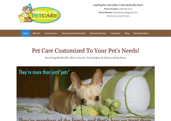
7: Sarah Burns, Menly’s Pet Care
I’ve saved this one for last for good reason. You may want to make sure a box of tissues is close by.
I’ve known Sarah for many years. She is one of the hardest working professionals among us. It’s safe to say our entire community was right there with her when she told us that one of her pet sitters has lost a client’s dog (the absolute worst nightmare for any pet pro).
We were following her agonizing journey each day until finally we heard the GOOD news: the pooch was safely found! Phew…
Then Sarah had an epiphany, a moment of clarity. “What if I write about how we lost a client’s dog and share the experience with others right on my blog!”
While your gut reaction is probably “No way! Why would you do that?” The better approach is to do exactly what Sarah did.
She wrote an extraordinarily powerful and profound post with such emotion, transparency and honesty that you can’t help but admire and appreciate her.
Her blog article is a lesson for us all. Mistakes happen. Screw ups occur. Whether our fault, or not. It’s all in how you handle the situation that determines your professionalism.
I applaud Sarah and I know you will too once you see how she took responsibility for what happened.
Bonus: You can bet Sarah was full of FEAR before, during and after hitting publish on the article. But she did not let that stop her. And neither should you.
Fear will always be present in your life and business. It’s how you learn to work through the fear that determines your level of success.
Over To You
I hope these 7 examples have been helpful. Think about which ones resonate the most with you and which you can implement yourself.
You should notice at least one recurring theme. Value. Every single one of these pet professionals has figured out a way to add value to their user base to attract their dream clients.
To no surprise, it’s that exact thing (adding value) that defines successful SEO. Google will reward your website with high placement in the search results when it sees you are adding value to the user’s it sends your way.
I hope you bookmark and share this page (share buttons near top of page). I look forward to reading your comments and seeing what inspiration you may have found here that you could implement.
Final Thought: Feel free to leave a comment with your website and show us how you add value to your audience.
Photo Credit: http://www.flickr.com/photos/danielmorrison/ / CC BY 2.0
This Post Has 18 Comments
Comments are closed.



Check out our pet sitter’s site. http://www.zookeepersinc.com
It’s clean, simple and easy to navigate. Some sites have too much info and loses the attention of those of us with ADD.
Check out our pet sitter’s site. http://www.zookeepersinc.com
It’s clean, simple and easy to navigate. Some sites have too much info and loses the attention of those of us with ADD.
Hey Caryn,
Wow, really good looking site! I love the flash slideshow (very pro), nice wordpress blog, good job adding a newsletter sign up box and excellent use of a logo.
You’re right… clean, simple and easy to navigate are elements to strive for.
I’m not sure how well you currently rank in the search engines (and I’ve never seen this before), but from looking through your html code, your complete tag contents repeats itself 3 times throughout the code – including your doctype, css styles and meta tags.
Sorry if that’s web jargon, I just wanted to give you the heads up.
Other than that, you’re right on.
Joshua,
Would love to have you check out my website. I would appreciate any feedback that you could give me. I’m so computer “challenged” that it’s sad.
Thanks so much,
Debbie
~The Dog Walker CA LLC~
Joshua,
Would love to have you check out my website. I would appreciate any feedback that you could give me. I’m so computer “challenged” that it’s sad.
Thanks so much,
Debbie
~The Dog Walker CA LLC~
Hello:
Would ck. on website? I’ve been redeveloping it for ages & can’t get any constructive help from friends/clients. Thanks for anything. Ann – http://www.ourpetsitter.net. My ranking, for the most part, is not bad.
Those are all great sites, my only concern is load time on the flash sites(I didn’t even look at one of them it took too long to load) and over-crowding. My computer science professors always stressed simplicity is best, too much clutter draws the eye away from where you want it, takes longer to load, and tires the reader faster. Course this was before css came out but I think it’s still a valid point.
Your computer science teacher is absolutely correct: Simplicity often does work better.
Which site above did you experience taking a bit long to load?
[…] year, I wrote an article called “7 Examples of Pet Sitter Websites That Perfectly Connect With Visitors” and the response was extremely […]
Hi, these sites are okay at best, but from a user point of view they aren’t very efficient technologies (flash, music, giant headers). I think http://www.furendlypetcare.com is a great example of a good pet sitting website. It’s laid out clearly, engages users with cute photos, and allows users to interact via social networking as well. Their blog is pretty good too.
Hi Melissa, thanks for stopping by. While I could agree with you that viewing some sites as a whole may not give the fullest user experience, I chose these 7 sites because I found that each showcased at least one good valuable element of something we should all be doing.
For example, the first site I list displays press and awards very well. Another site tells their story and uses their About page in a captivating way. I want pet sitters to look at these individual site elements that I point out and think how they could use each one on their own sites.
With respect, Melissa, I don’t think your site is any better than any of the ones listed here. If anything, I think it’s cluttered and looks outdated. I’m not sure what you think your site is giving the viewer that other sites are not, but I’m interested in your answer to that. You might want to reconsider replacing a few of the photos you are using. A few look very amateur which I know isn’t the image you want to convey. I’d also suggest a larger font for us old people! I couldn’t read your “about us” without my reading glasses (embarrassing!)
I like that you use your full name and that your service area is prominent. I look at so many sites where I can’t figure out where they are located!
I had a flash point website &, finally, a fellow sitter explained the technology behind it & suggested if I had the energy – look else where. That was about eight to nine months ago & I’m very happy I took his advice. I, too, read everything I can on how to spread the good word on my website. It’s a lot of work, boring and difficult to understand many times, but the money’s better in my pocket than paying someone to do it for me & in the end I’ve not learned a thing. When it comes to my business I’m a micro-manager.
I’ve just finished up buiding a pet sitting website for my girlfriends business here in the UK.
http://www.petcheckers.co.uk/pet-sitting-lincoln
I really like the look of it, what do you think?
I must say, I really like the rotating testimonial box you have on your wordpress template too!
Ben
Hi Ben,
Your site is looking good! Thanks for stopping by and let me know if I can help out in any way.
A lot of your links are out of date.
I’ve been in business for 20 years. Absolutely love what I do. Thank you for a great article